Comics journalism round-up: Symbolia, Susie Cagle, more
After some delays on the production end, the 53-page "Space" issue of comics journalism tablet magazine Symbolia hit inboxes at the end of February. The theme is space this time around, particularly our relationship with outer space. Journalist/illustrator Roxanne Palmer explores black holes for the lead-off feature, and cites an experiment at China's Nanjing University that had researchers mimicking the mysterious aspects of black holes in order to explore the phenomena in a controlled environment.Palmer gets a chance to blend in pastel-hued psychedelic nuances with the depictions of what she learned in her more straightforward reporting — portraits of her sources are built in rough, sketchy lines, with meaty quotes popping alongside diagrams and against colorful backdrops. It looks like Eduardo Risso's pages from Spaceman, the bold 2011 Vertigo mini-series, minus writer Brian Azzarello's made-up language. Symbolia's traditional interactive features — hyperlinks for more research, visual pop-ups offering sidebar-type nuggets — are always welcome and enrich the reading experience.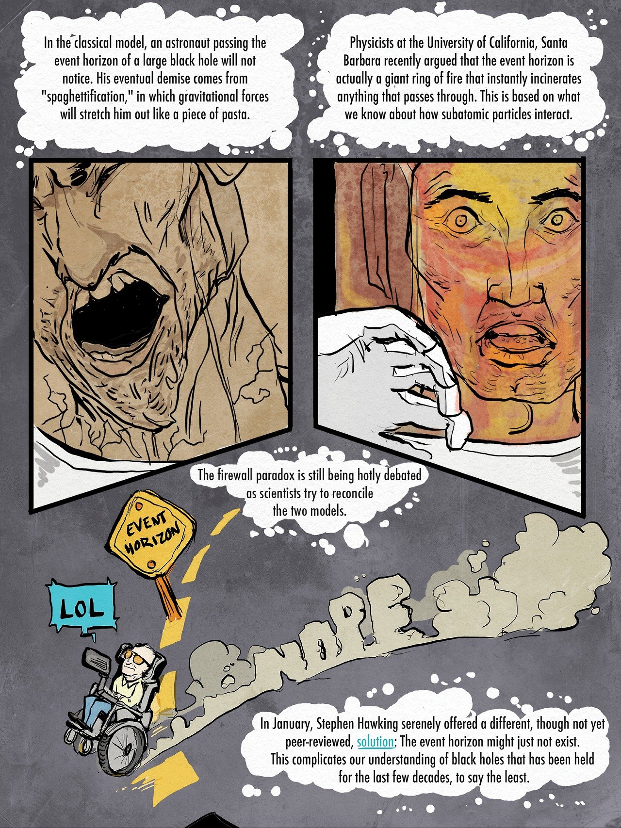 The release of Symbolia's "Space" issue marks the end of the bimonthly publication's first year — a double-sized preview issue debuted in March of 2013 (a bundle of back issues is available). I was sold back then on what I believe was the first I'd ever read about California's Salton Sea, the largest lake in the state at nearly 350 square miles. Symbolia's Salton Sea piece establishes a thorough history of the endangered body of water within a few pages — after a cyclical flooding and drying in the basin that had taken place for about three million years, 1970s-era tropical storms flooded seaside towns, a bout of botulism crippled its marine life, and it's now home to fossils, a rotting decomposition smell, and a once-thriving, now-still marina (see a National Geographic update that ran in February). Reporter and comics journalist Susie Cagle spoke to experts as well as regular folk for her feature, combing shoreline towns for insight and ultimately offering a data-rich, visually vibrant overview of the issues affecting this region of California.
 Cagle paired affecting close-ups of her interviewees with imagery of office interiors as well as crafty infographic-styled illustrations and striking, ground-level visual storytelling reported from the dry beds of the Salton Sea. It's a beautiful, memorable work, and I'm glad to have seen a personal essay that she posted to Medium last week on her history and struggles as a freelancer — I'm hoping that one of the reckless editors who owe her money pay out her invoices soon. Cagle is working on a number of things right now, and she keeps her Tumblr updated with links to new work.
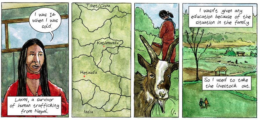
 I've signed up for the Archcomix newsletter, which collects updates on Dan Archer's comics journalism in one place. Archer is up for a One World Media Award for his work on human trafficking in Nepal, a reporting project produced by the BBC. In Nepal, experts "estimate that about 200,000 girls and women are working in Indian brothels, with up to 7,000 more arriving every year," reports Rachel Williams for The Guardian. For his 2013 piece, Archer hones in on one trafficking survivor named Laxmi, who was initially taken by traffickers from her family's farm and forced into sexual slavery. Her testimony is two decades old, and represents a less complicated view of Nepal's trafficking epidemic. Human trafficking means that girls are forced into multiple kinds of labor, not just forced sex work. Archer reports that the average trafficker is a relative of the victim that promises "educational opportunities in the city." It's "unsurprising that women are duped" in these scenarios, writes Williams. "(T)raveling abroad to find employment opportunities is far from unusual (in Nepal) – more than 100,000 women are thought to go to India every year as non-trafficked migrant workers […]." Archer uses watercolors to evocative effect in portrayals of his discussions with sources, to convey the horrors of the kidnappings in Nepal, and occasionally, positions himself inside the panels, sketching conversations or mapping out details. Find more of his work here and check out a conversation Archer had with Idea Lab from PBS's MediaShift.
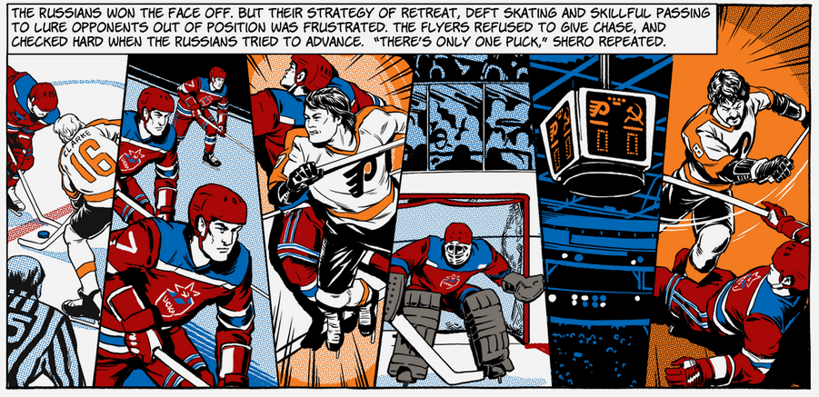
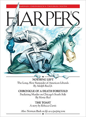 A few pages of the March 2014 issue of Harper's magazine go to London-based comics journalist Olivier Kugler, who has done a great deal of visual storytelling for The Guardian and more. The focus of his Harper's piece is a refugee camp called Domiz, in Iraqi Kurdistan, where more than 42,000 people have sought safety from the Syrian civil war (more from the New York Times). In lieu of a narrative dictated sequentially in panels, Kugler profiles three refugees in full-page illustrations that are remarkable, a mesh of colored work, specifically not-colored line drawings that overlap the colored ones. This is subscriber-only content, and I recommend hunting this issue down (also for two other stories in there that I appreciated). Spend the afternoon with Kugler's other reporting here.On a much lighter note, The Philadelphia Flyers have won five straight games, with the most recent drubbing having been dealt to the number one team in the NHL. Even if you could care less about organized sports, this is a mighty streak for those of us born in the suburbs of Philly. Print and online longform magazine Victory produced a wild piece of comics sportswriting about 1970s-era Flyers hockey in February that's partly animated, all vintage Marvel-looking. It's fantastic. Sports columnist/reporter Dave Hollander remembers the standoff between Philly's "Broad Street Bullies" and the Soviet Red Army Hockey Team, a Russian government-owned hockey club that toured North America in 1975 and 1976. Artist Stephen Halker's rendering of on-ice action is flashy and ripples with energy, beginning as a memoir comic of sorts that traces the game day from the perspective of Flyers defenseman Ed Van Impe. Hollander's copy is both humorous and packed with detail, while Halker's application of color and graphic design is explosive, emphasizing each gritty piece of the era and a truly weird day in Philadelphia sports history. Check it out here.